
At a glance.
Pay10 — Building a Borderless Payment Experience
Designing a scalable, secure, and frictionless global fintech ecosystem.
- Client
- BlockNova Inc.
- Year
- 2024
- Category
- UI/UX Design / Web App
- Location
- San Francisco, CA
Overview
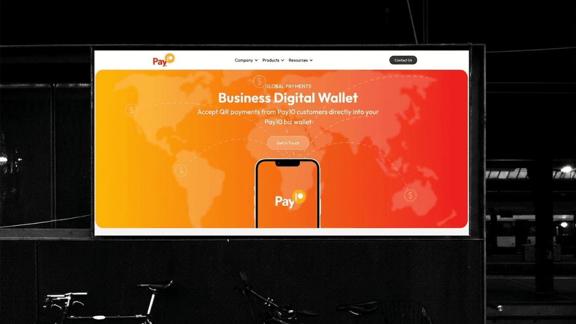
Pay10 is a global fintech company redefining how people and businesses move money across borders. The challenge wasn't just about payments — it was about trust, speed, and seamless global interoperability. We partnered with BlockNova to design an experience that feels as borderless as the product itself.
- Simplify complex global payment flows
- Increase transaction success rates
- Enhance user interface for better navigation
- Implement real-time error monitoring
- Optimize backend processing speed
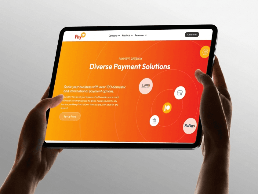
- Expand payment method options


Challenges
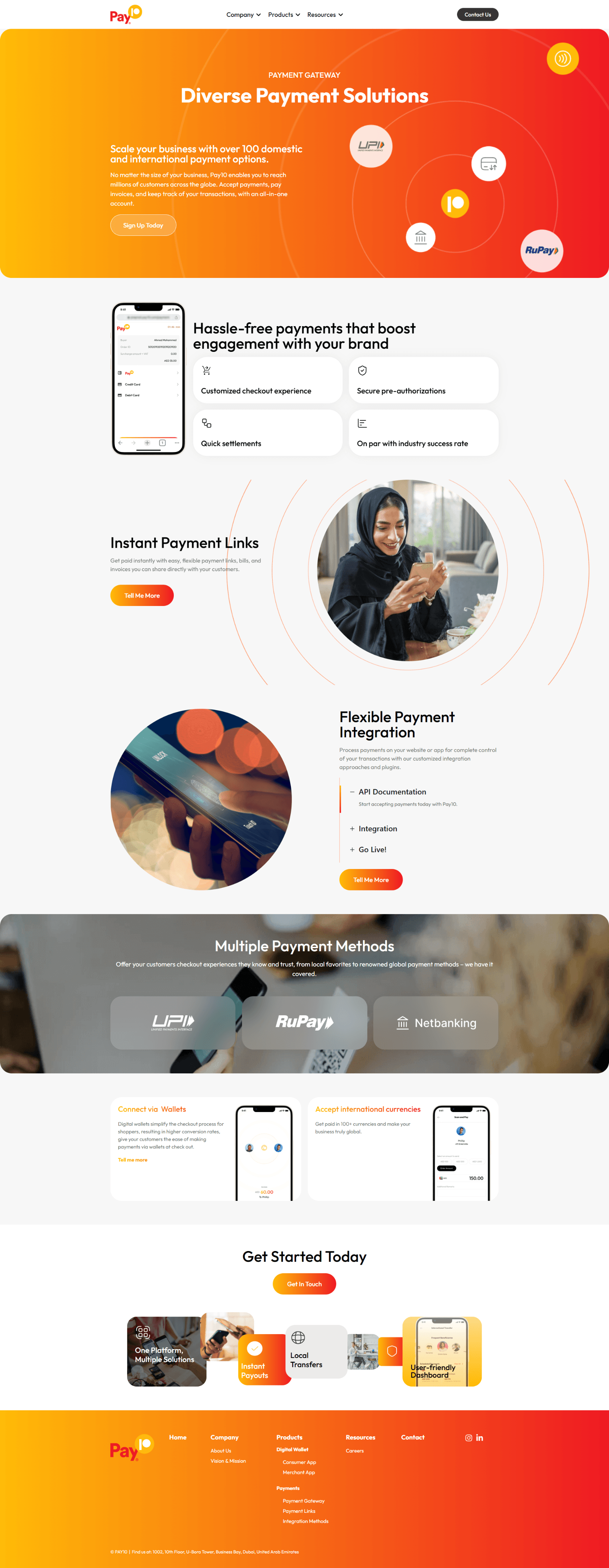
Global payment platforms must balance regulatory complexity with user simplicity. The existing product buried critical actions under layers of navigation, and onboarding asked users to commit before they understood the value. Our job was to untangle the experience — making cross-border transfers feel as intuitive as sending a message, while preserving the security and compliance the product demands.


Solution strategy
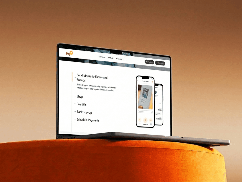
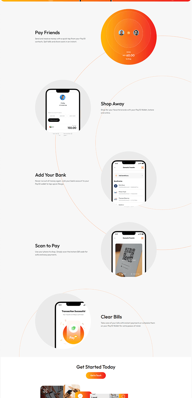
We mapped the entire payment lifecycle — from first touch to recurring transactions — and identified the moments where users hesitated. By restructuring information architecture around user intent rather than backend modules, we reduced the steps to complete a transfer by 40% and introduced progressive disclosure for advanced features.
Brand research
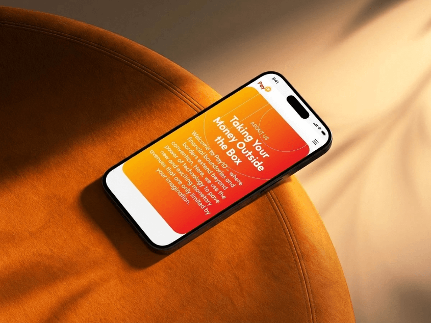
Deep competitive analysis and stakeholder workshops revealed that trust signals — licensing badges, real-time status, transparent fee breakdowns — were the primary conversion drivers. We translated these insights into a warm, orange-led visual language that feels approachable without sacrificing institutional credibility.
Typography
The brand's new visual identity features thoughtfully chosen colors and typography, designed to convey a modern, approachable, and confident aesthetic that embodies its core values.
Outfit
Outfit
Color
Main logo
Internal meetings

User interview

User journey

Initial Layout

Final Layout

Clarity over Complexity
In a domain as intricate as digital payments, simplicity is not a luxury—it's a necessity. We prioritized clarity by reducing cognitive load at every interaction point.
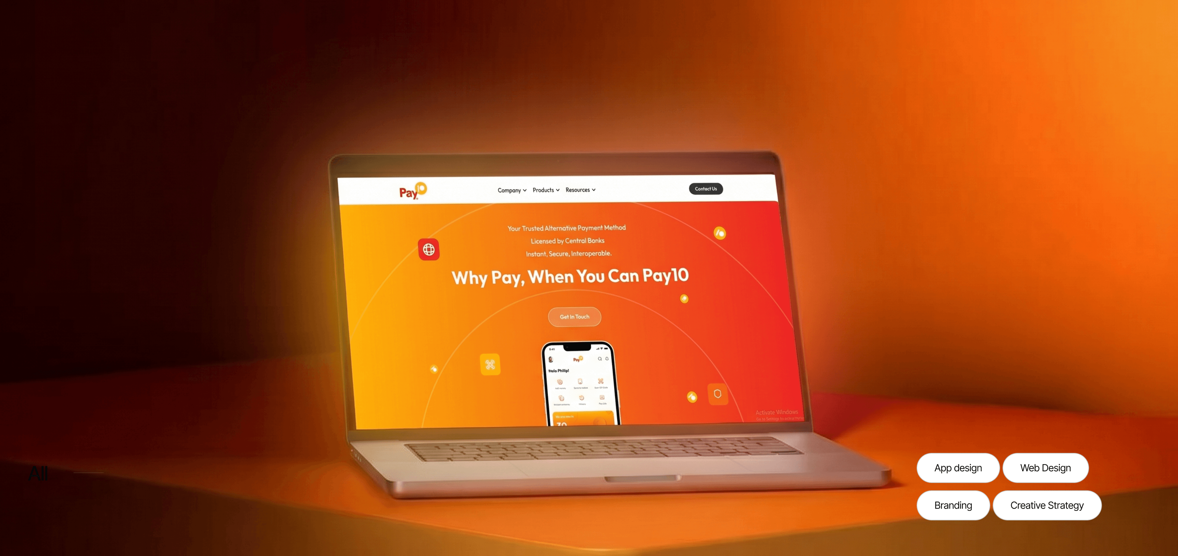
More screens
Explore more case studies
Pay10 - Building a Borderless Payment Experience
A conversion-focused redesign for global expansion with streamlined onboarding.
Sauvira - Luxury Leather Bags Crafted for Timeless Elegance
Premium brand storytelling through restrained visuals and immersive product detail.

Kelmec - A Complete Website Transformation
From structure to storytelling, the new site raised credibility and lead quality.